It’s been a busy first few months of 2020 for the Envisij development team who’ve been hard at work to deliver new analytics + tools. We’re continually aiming to improve our ability to help our customers reduce their energy costs, consumption and emissions using the UtilitySMART platform. Here’s a round-up of the platform feature releases and updates for Q1 2020:
1. Demand Management, switching of connected electrical loads to User-set Schedules.
We completed the roll-out of the new Demand Management product that integrates our onsite switching hardware with simple to use Dashboard/Control Panel management package. UtilitySWITCH provides customers the ability to switch connected loads such as Compressors, Fork-Lift truck charging, Freezers etc on/off in order to reduce emissions, cost and peak demand.
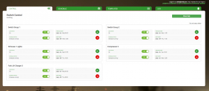
The UtilitySWITCH platform comprises of 3 Admin functions:
A Control Panel (see below) that provides a real-time status check on all connected loads and includes overrides of UtilitySWITCH remote controlled breakers and allocated load switching schedules.
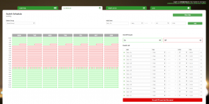
A Scheduler that can be allocated to address on-site remote-controlled relays/breakers (see image below). Different Schedules generated via the Template Builder can be allocated depending on the operational needs of the attached electrical equipment.
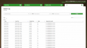
A Log (see below) that provides an audit trail of all on/off triggers per Switch regardless of location.
2. Improved resolution of data graphics.
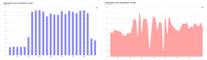
Prior to Feb of 2020 our consumption, cost and carbon graphs used to use column charts and scaled reporting, e.g. if a month’s energy use was viewed the graphs would show 24-hour totals as opposed to tighter data granularity.
We wanted to change the way data was viewed from column to area-charts for better understanding, and also use 30-min based granularity as opposed to 24-hour to help customers better understand consumption patterns and identify more areas of energy inefficiencies for possible improvements.
Our development team got busy on the graphics and database management improvements and released the upgraded graphics in March. The 2 images below provide a 24-hour before & after view of our enhanced Consumption Element (think of an Element as being a “nano-app”).
3. Power Metrics. A new Element added to the Envisij Dashboard line-up.
We wanted our customers to be able to understand the underlying power performance behind the kWh consumption figures. We’ve been working with our hardware partner, Wattwatchers to improve the data their API can provide from our on-site power monitoring hardware.
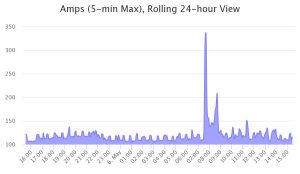
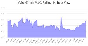
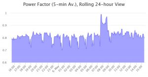
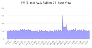
As a result, Envisij Dashboard users can now visualise a wide range of electrical parameters for improved power quality analysis. One screen provides real time values for kW, V, I & PF, plus easy to view Power Metric graphs of the last 24-hour performance in 5-minute increments. Data can also be exported in one click to image, PDF and CSV format.
Power Metrics provides customers with a one-shot view of equipment, area or building level electrical use and quality. Typical benefits of Power Metrics will be planning for EV Charging expansion/introduction or initial installation onto electrical distribution boards, power factor correction improvements to reduce equipment failure and costs, check for voltage surges to highlight potential equipment damage.